Statistics for Exam 1
The following images should give you some insight as to where you stand relatively to your classmates. The passing mark, grade D, is 50 out of 100.
Everything above 95 is A. The rest are scaled in between.
We start with a histogram of relative frequencies. This shows the amount (in percentage) of papers that got the grade that you see on the x-axis.
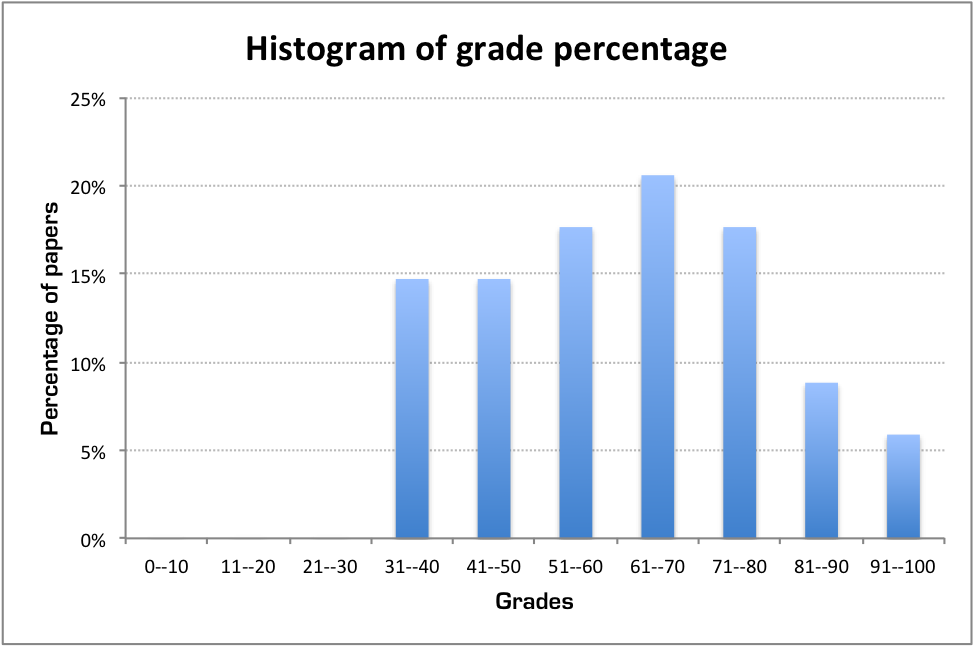
From the figure above you can easily measure the percentage of students that passed the test.
In case you missed it, here is another graph:

Finally, you can see all the grades, the mean, and the median (if somebody doesn't know what these are, feel free to ask!).
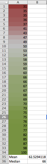
Overall I think you did pretty good. The greener your grade is, the better.
Almost all of you would have done at least 10 points better if you had understood the problems in the review sheet.
Thank you for your time :)